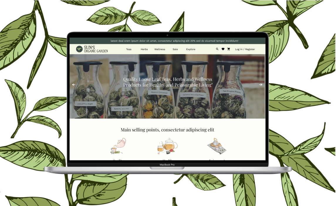
How might we make it easy for Sun's customers to browse and shop for tea online?

How might we make it easy for Sun's customers to browse and shop for tea online?
5 weeks
Joanna Choi (UX/UI Designer)
Stacy Lee (UX/UI Designer)
Amelia Oon (Illustrator)
Christine Pourheydarian (Web Engineer)
Figma
Weebly
Stakeholder Interviews
Competitive Analysis
Low-High Fidelity Wireframing
Prototyping
Style Guide
Sun's Organic Garden is a tea shop in Chinatown that sells high quality, organic loose leaf tea. The store is known for its stellar customer service and quality in ingredients. As a result of the Covid-19 pandemic reducing foot traffic in the physical store, the owner of Sun's Organic Garden reached out to create an online store .
To organize the store's information and products, we analyzed three existing tea stores. We examined August LA's site for its simplicity and David's Tea and TenRen's tea for their similar section of Chinese teas. Below are similarities and differences in features among the competitive landscape.

We began our low-fidelity wireframes by first including the best practices from Core DNA's e-commerce site recommendations. We reviewed the low-fidelity wireframes with the client to make any additional edits before moving into a higher fidelity.

In the header navigation bar, we created a mega menu for the Teas category. By having the mega menu open upon hovering on the Teas category, users can see and decide how they want to sort through the teas in one easy click. After multiple rounds of iterations from low to high fidelity, we created two mega menus: one for customers to Explore traditional tea and one for customers to quickly see the tea options by category.

The client wanted a website that was organic, positive, and had a personal touch. We created a moodboard for inspiration and developed a color palette and typography that would convey the store's brand. To maintain consistency among the website pages and across social media, we developed the following style guide. It includes Sun's Organic Garden's logos, typography, color palette, and our inspiration.

Since the completion of the design, the engineer has been building the website in Weebly. In addition, an SEO marketing expert is working with the client to increase online engagement. After the online store goes live later in December 2020, it would be interesting to analyze how customers navigate the website. Had there been more time to work on the website design, I would have conducted user interviews with current and prospective customers to understand different mental models for tea categorization.